kensethfan
World Racing Legend

Posts : 1905
Join date : 2009-08-25
Age : 26
Location : Living in a box under the stairs in the corner of the basement in the house half a block away from Jerry's Bait Shop (You know the place).
 | Subject: NNRCS Cars (#82)  Sat Dec 15, 2012 1:44 am Sat Dec 15, 2012 1:44 am | |
| I have a feeling that I accidentally based the scheme on this car after one of the old Penske Kodak cars without realizing. 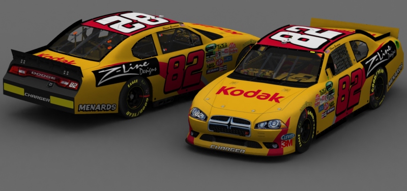 Click on the render to download this carfile. Credits:Template: DMR Base: Me Numbers: Masgrafx Logos: Google, Masgrafx Contingencies: Me Miscellaneous: Me, Google, Wikipedia | |
|
VincentGiac426
Admin


Posts : 2363
Join date : 2009-05-30
Age : 30
| | Subject: Re: NNRCS Cars (#82) Sat Dec 15, 2012 4:06 am | |
| No offense, but a few small details make this car a bit lackluster. The base is decent, but the hood logo needs to be a bit bigger, the numbers could use a yellow stroke and the Z-Line logo should just be the text.
I can't see any overt resemblance to the old Gaughan/Kvapil cars, personally - and this is coming from the guy who scours for retro references in racing with the finest-tooth comb ever. So don't worry about that. | |
|
Jesse Pizzajarvi
Admin

Posts : 4133
Join date : 2010-09-02
| | Subject: Re: NNRCS Cars (#82) Sat Dec 15, 2012 12:58 pm | |
| Get rid of that black box on the Z-Line logo... | |
|
kensethfan
World Racing Legend
Posts : 1905
Join date : 2009-08-25
Age : 26
Location : Living in a box under the stairs in the corner of the basement in the house half a block away from Jerry's Bait Shop (You know the place).
| | Subject: Re: NNRCS Cars (#82) Sat Dec 15, 2012 3:18 pm | |
| - AmpEnergy426 wrote:
- No offense, but a few small details make this car a bit lackluster. The base is decent, but the hood logo needs to be a bit bigger, the numbers could use a yellow stroke and the Z-Line logo should just be the text.
I can't see any overt resemblance to the old Gaughan/Kvapil cars, personally - and this is coming from the guy who scours for retro references in racing with the finest-tooth comb ever. So don't worry about that. I agree the hood logo could be a bit bigger, but I don't see what removing the background on the Z-Lines logo would improve. In the best way I could describe it, I think that just text would look a bit "out of place" for this scheme. As far as resemblance goes, I was thinking moreover towards the Kodak cars Ryan Newman ran in '07 - '08. | |
|
Se7en
Racing Phenom

Posts : 591
Join date : 2011-10-22
Age : 27
| | Subject: Re: NNRCS Cars (#82) Sat Dec 15, 2012 9:50 pm | |
| I personally think the door numbers need to be white. Liking the car though. | |
|
Sponsored content
| | Subject: Re: NNRCS Cars (#82) | |
| |
|