| | 2011 NORA Castrol Cup Series Showroom Thread |  |
|
+4Its Webzic moppenheimer VincentGiac426 7 8 posters |
| Author | Message |
|---|
Guest
Guest
| Subject: 2011 NORA Castrol Cup Series Showroom Thread  Fri Jul 16, 2010 11:56 am Fri Jul 16, 2010 11:56 am | |
|  #1 Jeremy Wentworth  #3 Ron Mertz 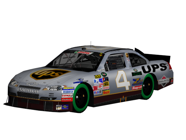 #4 Carmen Del Rio 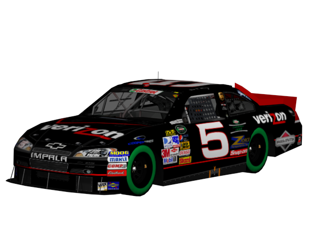 #5 Sean O'Kelley 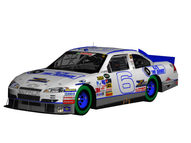 #6 Brian Lineberry 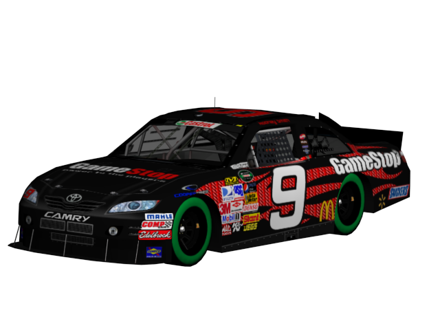 #9 Rodney Smith 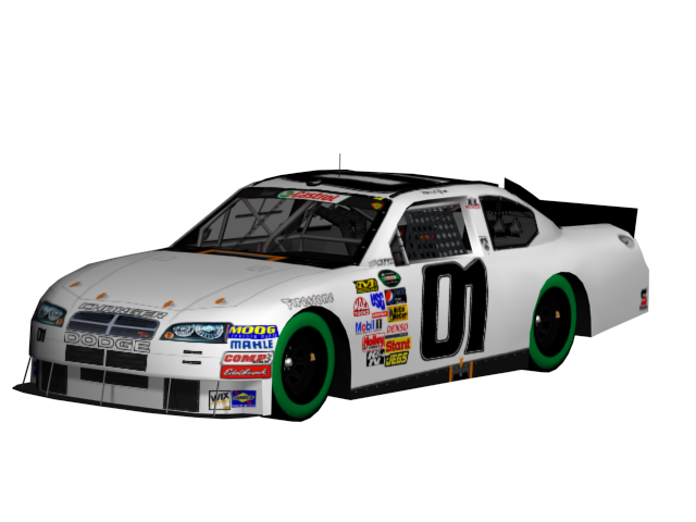 #01 David Rome 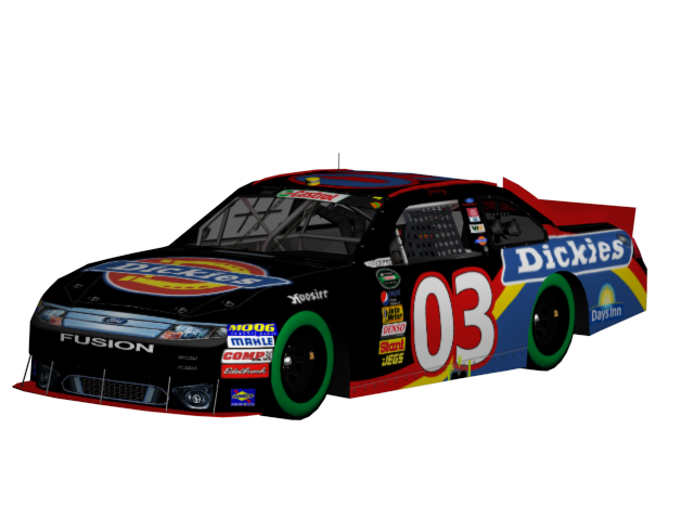 #03 Jimmy Collins 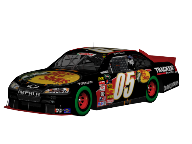 #05 Scott Nowak  #06 Jen Smith  #09 Jason Ness  #10 Todd Chaffin  #11 Jack Asher 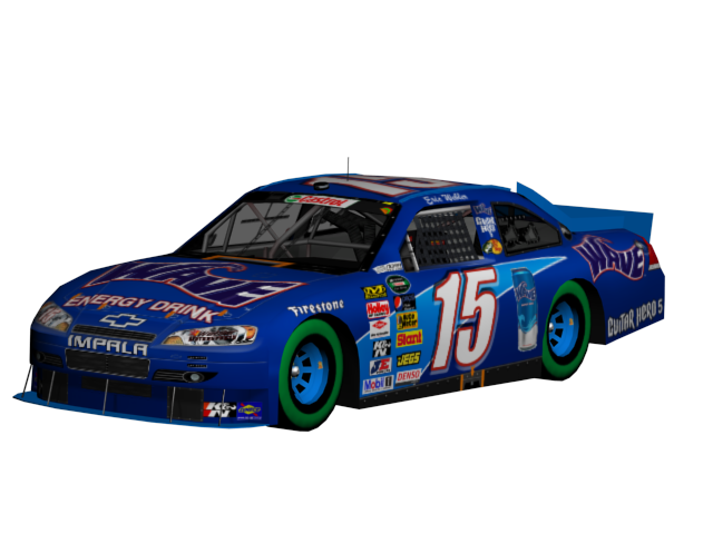 #15 Eric Webler  #23 Arthur Gillard 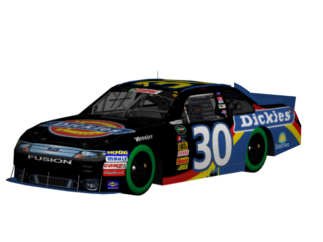 #30 Joey Collins 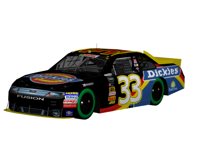 #33 Johnny Collins  #35 Tyson Lautenschlager 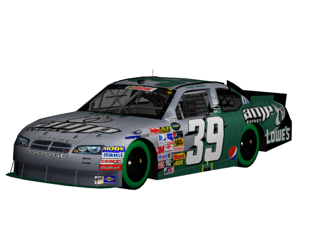 #39 Cody Schacher 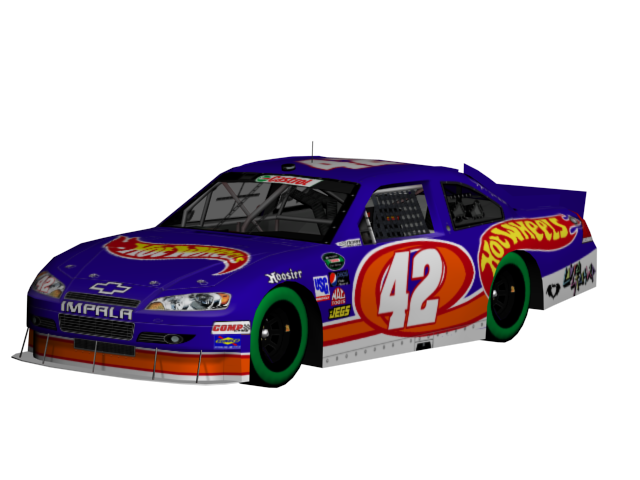 #42 Driver TBA 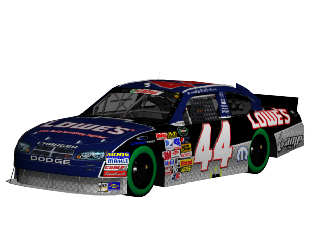 #44 Randy Callahan 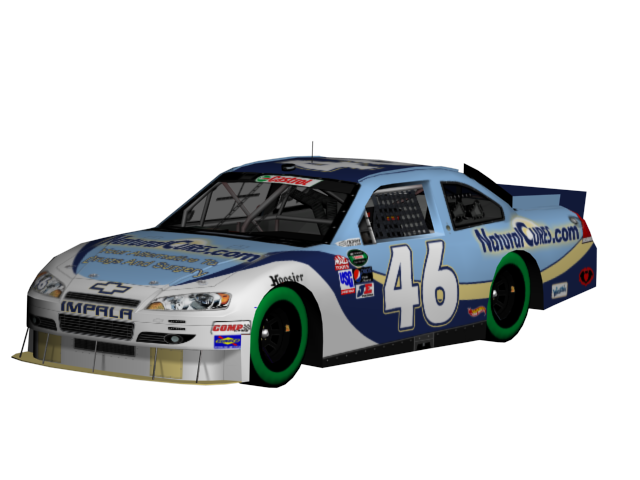 #46 Herb Cilantro 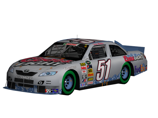 #51 Tory Webler 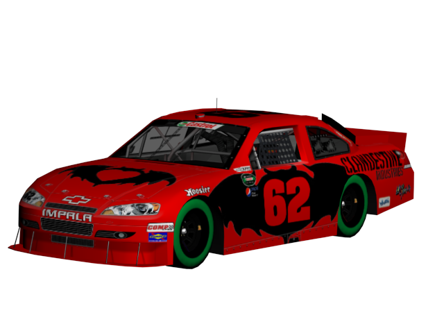 #62 Luke Knight 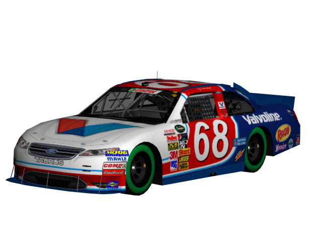 #68 RJ Bandsma 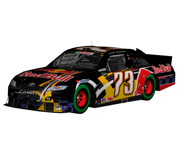 #73 Jacob Eichholtz 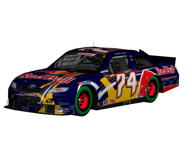 #74 Cody Lone  #75 Justin Houk 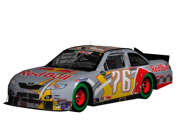 #76 Jake Wyrick 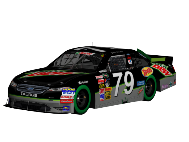 #79 Justin Bandsma  #80 Randy Carpenter  #81 Josh Mertz  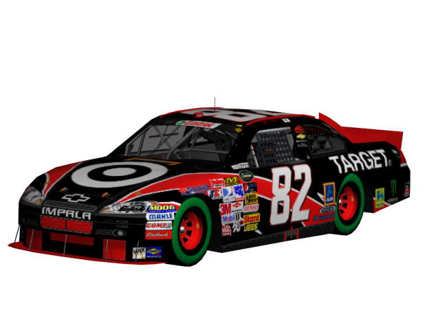 #82 Kyle Kos 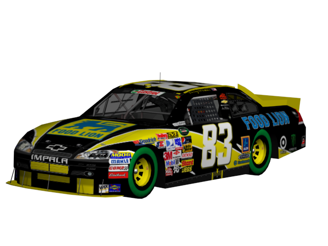 #83 Terry Cloutier 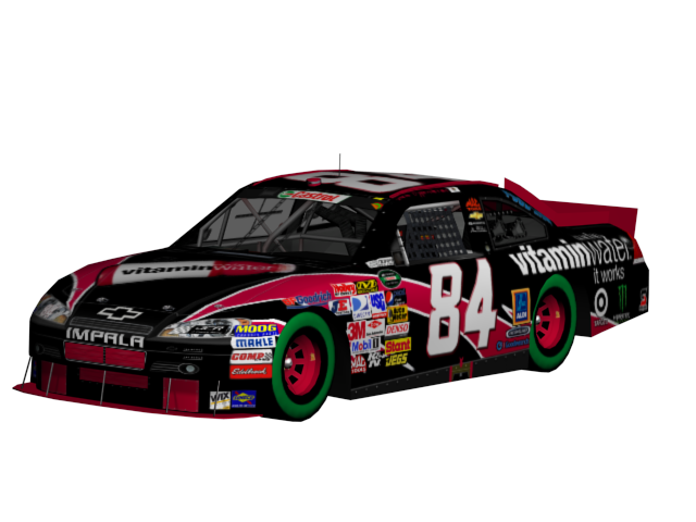 #84 Mike Oppenheimer 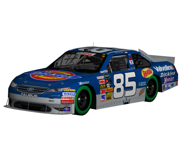 #85 DJ Bandsma 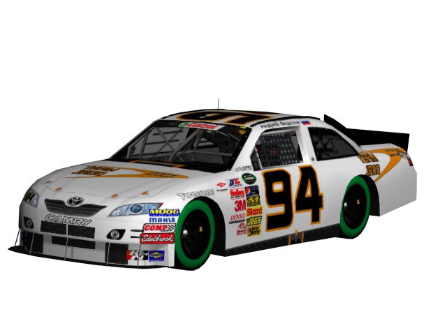 #94 Andrey Fedosov 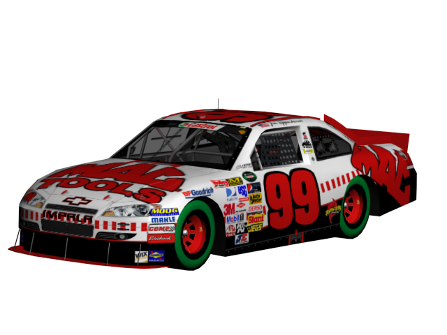 #99 Jim Oppenheimer |
|
| | |
Guest
Guest
| | Subject: Re: 2011 NORA Castrol Cup Series Showroom Thread Fri Jul 16, 2010 12:06 pm | |
| Favorites: #4 #09 #23 #68 #73 (well duh  ) |
|
| | |
7
Forum Founder, Admin


Posts : 7740
Join date : 2009-05-16
Age : 29
| | Subject: Re: 2011 NORA Castrol Cup Series Showroom Thread Fri Jul 16, 2010 12:09 pm | |
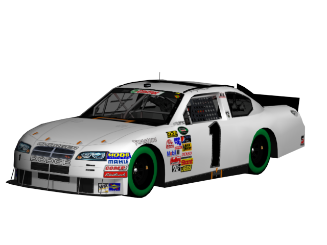
| 83 yellow needs to be blue,. and the 6 and 5 look odd IMO. | |
|
| | |
Guest
Guest
| | Subject: Re: 2011 NORA Castrol Cup Series Showroom Thread Fri Jul 16, 2010 12:30 pm | |
| my favs are
9
33
62 (duh)
Red Bull cars
and JCR cars, love the base |
|
| | |
VincentGiac426
Admin

Posts : 2363
Join date : 2009-05-30
Age : 30
| | Subject: Re: 2011 NORA Castrol Cup Series Showroom Thread Fri Jul 16, 2010 12:38 pm | |
| My personal favorites:
05
81
44
85
All the 426 entries (obviously) except for the 46. Something just...looks out of place on it...
A few notes:
- The green wall on the tire is way too thick and it looks like the tires themselves are all green. IMO, making the wall thinner would help the cars' overall aesthetic appeal.
- The number on the 4 should be either be colored brown or outlined in brown.
- The bottom stripe on the 5 should be red with a silver outline instead of black with a red outline.
- The 6's number should be a different color.
- The Raskin cars NEED SPONSORS...
- Wonderful job on the Red Bull cars. Never thought it was possible for four cars with that sponsor to have that much differentiation.
- The font on the Bandsma cars (save the 85) is way too generic.
Last edited by AAROdynamic426 on Fri Jul 16, 2010 12:58 pm; edited 2 times in total | |
|
| | |
moppenheimer
#GlossumSUX

Posts : 1113
Join date : 2010-03-10
| | Subject: Re: 2011 NORA Castrol Cup Series Showroom Thread Fri Jul 16, 2010 12:51 pm | |
| 1, 01, 10, 11 -- Dodge logos look weird in white
6 -- Impala logo, Number should be Blue
RJ's 68 79 80, -- Number looks too thin, doesnt fit, should be like the 85
| |
|
| | |
Its Webzic
NRPA Owner, Admin
Posts : 3206
Join date : 2010-03-05
Age : 27
Location : My tub
| | Subject: Re: 2011 NORA Castrol Cup Series Showroom Thread Fri Jul 16, 2010 2:20 pm | |
| My Favorites:
#05
#15
#9
#35
#42
#46
#51
#23 (what font is the number?????)
#99
#85
#81
#82
#84
Red Bull Cars
Gonna be an exciting season! | |
|
| | |
Guest
Guest
| | Subject: Re: 2011 NORA Castrol Cup Series Showroom Thread Fri Jul 16, 2010 2:54 pm | |
| - Eric Webler #15 wrote:
- My Favorites:
#05
#15
#9
#35
#42
#46
#51
#23 (what font is the number?????)
#99
#85
#81
#82
#84
Red Bull Cars
Gonna be an exciting season! Looks like Kimberly. Not sure. |
|
| | |
Guest
Guest
| | Subject: Re: 2011 NORA Castrol Cup Series Showroom Thread Fri Jul 16, 2010 2:58 pm | |
| |
|
| | |
Alessandro Milano Rossini
Racing Phenom

Posts : 579
Join date : 2009-07-28
Age : 33
Location : Kent, England
| | Subject: Re: 2011 NORA Castrol Cup Series Showroom Thread Fri Jul 16, 2010 4:29 pm | |
| Like them all but for the texture on the flame of the #9. Just doesn't look good in my opinion. | |
|
| | |
Guest
Guest
| | Subject: Re: 2011 NORA Castrol Cup Series Showroom Thread Fri Jul 16, 2010 4:32 pm | |
| like them all. josh u did a awesome job with the cars. can't wait for the 2011 season to start. |
|
| | |
Tyson Lautenschlager
Moderator

Posts : 1658
Join date : 2009-07-27
Age : 27
Location : Canada
| | Subject: Re: 2011 NORA Castrol Cup Series Showroom Thread Fri Jul 16, 2010 11:52 pm | |
| Again, the 62 looks horrific. | |
|
| | |
7
Forum Founder, Admin
Posts : 7740
Join date : 2009-05-16
Age : 29
| | Subject: Re: 2011 NORA Castrol Cup Series Showroom Thread Fri Jul 16, 2010 11:59 pm | |
| The 83...I know I've said it before but I looked at it again and CANT SEE THE NUMBERS either. Change to blue! | |
|
| | |
Guest
Guest
| | Subject: Re: 2011 NORA Castrol Cup Series Showroom Thread Sat Jul 17, 2010 12:48 am | |
| - DangerousDogRacing wrote:
- Again, the 62 looks horrific.
what do you mean by THAT |
|
| | |
moppenheimer
#GlossumSUX
Posts : 1113
Join date : 2010-03-10
| | Subject: Re: 2011 NORA Castrol Cup Series Showroom Thread Sat Jul 17, 2010 1:02 am | |
| - NateThe#1Hndrkfan wrote:
- DangerousDogRacing wrote:
- Again, the 62 looks horrific.
what do you mean by THAT I think its pretty clear what he means... | |
|
| | |
Guest
Guest
| | Subject: Re: 2011 NORA Castrol Cup Series Showroom Thread Sat Jul 17, 2010 1:09 am | |
| - moppenheimer wrote:
- NateThe#1Hndrkfan wrote:
- DangerousDogRacing wrote:
- Again, the 62 looks horrific.
what do you mean by THAT
I think its pretty clear what he means... I know, i was joking because thats' my driver |
|
| | |
lat8829
Racing Legend

Posts : 297
Join date : 2009-07-11
Age : 34
Location : Lawrence, MA
| | Subject: Re: 2011 NORA Castrol Cup Series Showroom Thread Sat Jul 17, 2010 1:21 pm | |
| Ok, my thoughts on NCCS '11 cars.
#1 - White + Unsponsored = Boring, Hope there's sponsorship soon, plus the Dodge & Charger need to be in black.
#3 - Despite the fact it has Dale written all over it, it's good... except that Z-Force logo, move it to the rear decklid.
#4 - I'm sorry to say this, but silver does not work for UPS, maybe for frieght, but not normal, its needs to be either Brown, or possibly Goldish Yellow.
#5 - Pretty cool, I think red on the bottom would make it look twice as better.
#6 - Good, but white numbers and logos on white background doesn not work... ever. Make it blue.
#9 - I said it before and i'll say it again, WAY Better than last year's car.
#01 - same as #1
#03 - Great car (as before in other post), roof numbers need to be white or yellow.
#05 - Great looking car, kinda has the same look like in Josh's GIMP tutorial, but I think the design got a bit covered by the sponsor, a minor fix.
#06 - Kinda saw this coming (Seriously, what is it with Cobra Starship?)
#09 - Pretty good, might not be as better as the #9, but it works.
#10 - Same as #1
#11 - Same as #1
#15 - THAT IS AWESOME! Looks much more betther than last year's NAAS car.
#23 - Kinda has that Brian Keselowski look going, and I REALLY Like the Taurus!
#30 - As before, the BEST of the Triple C Cars!
#33 - You know, I stand corrected about the roof numbers, they now kinda work, but this is still the weakest of the Triple C Cars.
#35 - As before, great looking car.
#39 - Nice car, just a bit unsure about Silver on the front, it needs to swap with the green.
#42 - Retro Hot Wheels look brings back good memories.
#44 - Great looking car, only problem, name on the side need to be thinner height-wise.
#46 - Still a great looking car, even if it has a different number and its on a different car.
#51 - Very nice, I think the one problem I have with it is the Mountains, I think they need to be bigger. Othen that that, Great Car.
#62 - Looks nice, nothing much else to say.
#68 - Great car, Bad number, that number needs changing SEVERLY.
#73 - Red Bull in Black, Very Cool.
#74 - Red Bull in Blue, Preety Obvious, but still cool.
#75 - Red Bull in Red, never thought i'd see it, but it actually looks good.
#76 - Red Bull in Sliver, also obvious, but also cool.
#79 - Same as #68
#80 - Simple, but good, numbers still a problem as on #68 and #79.
#81 - SO much better than last year's car!
#82 - Like it a lot, probably needs a color swap to make it look better.
#83 - Good... but the numbers need a blue outline, or the yellow needs to be blue.
#84 - Really like this car.
#85 - Good car, but why Dickies if there's already 3 cars with that sponsor?
#94 - Not bad, at least it has something on the car that on the #1, #01, #10 & #11, Camry name nned to be black.
#99 - Great looking car, might need to lower the sponsors a bit on the hood and the side.
| |
|
| | |
Guest
Guest
| | Subject: Re: 2011 NORA Castrol Cup Series Showroom Thread Sat Jul 17, 2010 5:48 pm | |
| My Faviorites
9
39
44
68
All the Red Bull cars
79
80
81
82 |
|
| | |
VincentGiac426
Admin
Posts : 2363
Join date : 2009-05-30
Age : 30
| | Subject: Re: 2011 NORA Castrol Cup Series Showroom Thread Sun Jul 18, 2010 9:28 pm | |
| - lat8829 wrote:
- #06 - Kinda saw this coming (Seriously, what is it with Cobra Starship?)
#42 - Retro Hot Wheels look brings back good memories.
#46 - Still a great looking car, even if it has a different number and its on a different car.
#62 - Looks nice, nothing much else to say. ONE MUST NEVER UNDERESTIMATE THE POWER OF THE COBRA. Oh, and thanks for the compliments.  | |
|
| | |
antknee
Race Winner

Posts : 61
Join date : 2009-07-04
Location : Dallas, TX
| | Subject: Re: 2011 NORA Castrol Cup Series Showroom Thread Mon Jul 19, 2010 1:40 am | |
| nice group of cars but that green stripe is quite distracting. i think the 99 is my favorite of the bunch. | |
|
| | |
moppenheimer
#GlossumSUX
Posts : 1113
Join date : 2010-03-10
| | Subject: Re: 2011 NORA Castrol Cup Series Showroom Thread Mon Jul 19, 2010 2:34 am | |
| - antknee wrote:
- nice group of cars but that green stripe is quite distracting. i think the 99 is my favorite of the bunch.
Thanks  | |
|
| | |
Its Webzic
NRPA Owner, Admin
Posts : 3206
Join date : 2010-03-05
Age : 27
Location : My tub
| | Subject: Re: 2011 NORA Castrol Cup Series Showroom Thread Mon Jul 19, 2010 10:03 am | |
| - lat8829 wrote:
#05 - Great looking car, kinda has the same look like in Josh's GIMP tutorial, but I think the design got a bit covered by the sponsor, a minor fix.
#15 - THAT IS AWESOME! Looks much more betther than last year's NAAS car. Ya, this is like the design on the gimp tutorial, It's simple and quick. Thanks. - lat8829 wrote:
#51 - Very nice, I think the one problem I have with it is the Mountains, I think they need to be bigger. Othen that that, Great Car. Thats the only mountains I could find, I'm lucky I found any, lol. Also thanks. | |
|
| | |
Alessandro Milano Rossini
Racing Phenom
Posts : 579
Join date : 2009-07-28
Age : 33
Location : Kent, England
| | Subject: Re: 2011 NORA Castrol Cup Series Showroom Thread Mon Jul 19, 2010 2:59 pm | |
| Eric, do you have Powerpoint 2003 or 2007? On that mountain template, if you open the slide master, you can take the mountains off there. If you don't have it, send me a base of the car without the mountains and I'll slap them on and see if it looks good at all... | |
|
| | |
Its Webzic
NRPA Owner, Admin
Posts : 3206
Join date : 2010-03-05
Age : 27
Location : My tub
| | Subject: Re: 2011 NORA Castrol Cup Series Showroom Thread Wed Jul 21, 2010 7:01 pm | |
| i like the mountains like that, well my dad does, he was a big sterling marlin fan and he always liked the paint scheme with just the mountains. there about the same size but the only difference it that there blue.  | |
|
| | |
Sponsored content
| | Subject: Re: 2011 NORA Castrol Cup Series Showroom Thread | |
| |
|
| | |
| | 2011 NORA Castrol Cup Series Showroom Thread | |
|